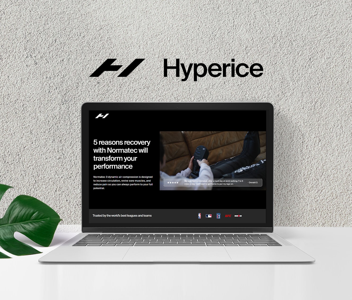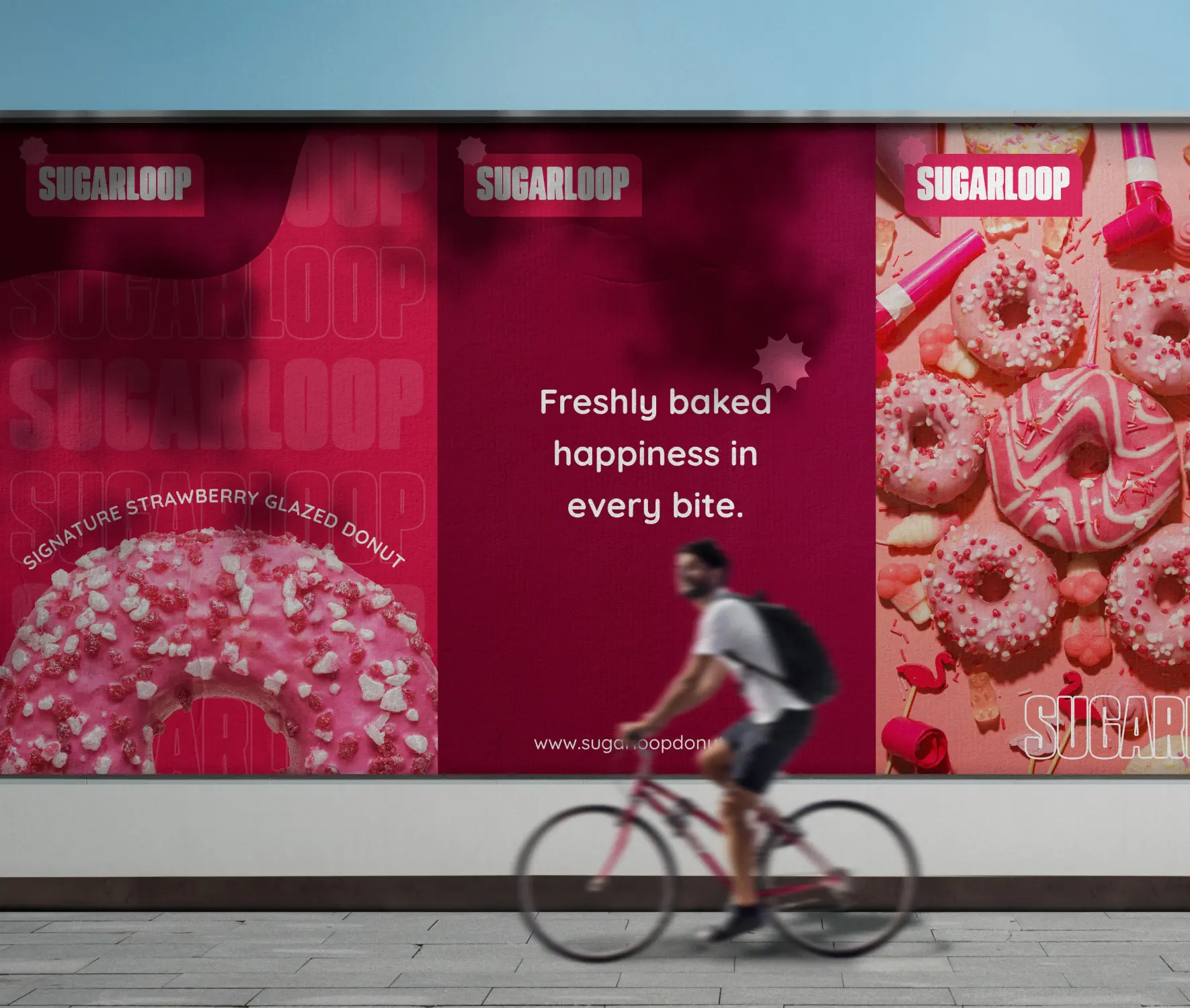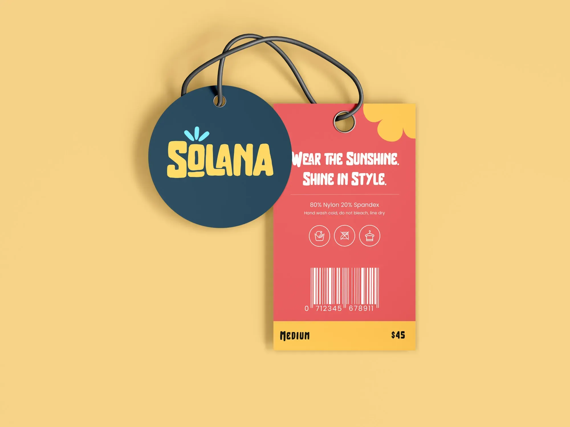
"Can you design us a logo?" is one of the most common first messages I get from new clients - and one of the trickiest to answer honestly, because a logo on its own rarely solves the problem they're actually trying to fix.
A logo is a mark. Branding is everything that mark has to work inside of: color, typography, photography style, tone of voice, the layout patterns that repeat across a site, packaging, social posts, and every other touchpoint a customer runs into. A great logo attached to an inconsistent system still reads as unfinished.
What a real visual identity system includes
Beyond the logo itself, a working identity system defines a color palette with clear rules for where each color is used, a type hierarchy that stays legible from a hero headline down to a footer disclaimer, and a set of visual patterns - spacing, imagery treatment, iconography - flexible enough to cover a website, a product page, and a social graphic without looking like three different companies made them.
This is the part that takes longer than a logo, and it's also the part that actually changes how trustworthy a brand feels to a stranger scrolling past it in three seconds.
People don't remember your logo. They remember the feeling of every touchpoint it showed up on.
Why consistency beats cleverness
Clients often want their brand to feel bold and distinctive, which is a fair goal - the problem shows up when "distinctive" means every new asset gets a slightly different visual approach. Distinctiveness comes from consistent repetition of the same specific choices, not from every piece trying to reinvent them.
Some of the strongest identities I've worked on look almost restrained at first glance. What makes them work is that the restraint is applied everywhere, every time - the same three colors, the same handful of type combinations, the same photography mood - until it becomes instantly recognizable without needing the logo in frame at all.
How to know your branding is actually working
The real test isn't whether people compliment the logo. It's whether someone can look at a social post, a product page, and an email with the logo cropped out and still recognize which company it belongs to. If the answer is yes, the system is doing its job - and that's usually when a brand starts converting better, not just looking better.
Questions I get asked a lot
Do I need a full rebrand, or just a refresh?
If the core idea still fits the business but execution feels inconsistent, a refresh - tightening the existing system - is usually faster and cheaper than starting over.
How long does a proper identity system take to build?
It depends on scope, but it's almost always longer than "just the logo" - because the logo is the smallest piece of the deliverable.
Can a small business afford a full identity system?
Scaled appropriately, yes - the goal is a system that's consistent, not necessarily one with dozens of assets on day one.